

11.02.2017
6.23.2015
Walking on the beaches looking at the peaches..
I have recently reclaimed an area of painting that is sometimes maligned or perhaps percieved as dated by the artworld; the impressionist beach scene. I like to think this allows me to paint without feeling like I need to challenge or push any boundaries as I am working in an area which is not really considered 'contemporary'- albeit we all know 'contemporary' is just lip service to an outmoded 'avant garde' notion and nothing is really that new anyway and justs pretends to be - so impressionist beach scenes are great for me - being ignored gives me the space to flex my paint muscles.
4.26.2015
Palm Springs
I have an ongoing interest in Palm Springs. more to the point I have often painted views based on photographs of the place, in particular vintage or photos from post-war America.
The El Mirador hotel is a great building to paint and I have done so a few times. It also has a fascinating history here:
http://blog.preservationnation.org/2014/09/22/brief-history-palm-springs-el-mirador-tower/#.VTy6CfBIiSo
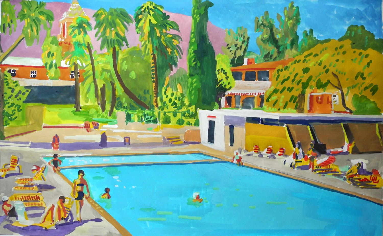 El Mirador hotel Palm Springs - gouache on paper

Frank Sinatra's house - gouache on paperThe El Mirador hotel is a great building to paint and I have done so a few times. It also has a fascinating history here:
http://blog.preservationnation.org/2014/09/22/brief-history-palm-springs-el-mirador-tower/#.VTy6CfBIiSo
4.20.2015
Recent work in gouache
I love working with this medium..perhaps it reminds me of when i was a kid playing with poster paint. I like the powdery texture and the way it sits on paper. I dont know why it never seems to be available in art shops, perhaps because people prefer acrylic, they are after all essentially the same paint however gouache doesn't have the binder and medium that acrylic has which i dont really like on paper and it works better on canvas.
For this current series of work I decided to focus more specifically on the 'jet-setting' aspect of my general interest in sun and beaches. I want to delve more deeply into scenes of 'cool' whici has always been a strange interest I have had..
 The meeting - gouache on paper
 The boat ride - gouache on paper

For this current series of work I decided to focus more specifically on the 'jet-setting' aspect of my general interest in sun and beaches. I want to delve more deeply into scenes of 'cool' whici has always been a strange interest I have had..
In vita dolce
4.17.2015
Ripping off Slim Aarons
In debt to Slim Aarons or ripping off Slim Aarons,
but then again so many have..let me see Tommy Hilfiger,
Ralph Lauren ok you get the picture. After reading an
interview with Aarons in a 2001 New York Times article
I am struck by his nonchalance and indifference to his influence to
the world of fashion and advertising, he looked upon it with disdain seeing himself and his work as a
realist doing documentary photography.

Pool scene - oil on canvas 28 x 40 '' (based on a Slim Aarons photo)

Backgammon by the pool - (based on a Slim Aarons photo)

Beach Scene - San Tropez? (based on a Slim Aarons photo)
1.14.2015
History painting

inspired by 'Lepanto' by GK Chesterton;
"Scarlet running over on the silvers and the golds, Breaking of the hatches up and bursting of the holds"...
full poem here - http://www.bartleby.com/103/91.html

Ascension day machinations - oil on canvas 40 x 28''
Just working on this piece - my idea was to paint an explosion in a classical way - or at least integrate it into a classical composition - that was my starting point however it can if you like also have a historical dimension:
from Wikipedia: Alfonso de la Cueva, 1st Marquis of Bedmar
In 1618 king Philip III charged him with the devolution of the territories conquered by the Spanish forces in Piedmont to the duke of Savoy. In 1616 Venice concluded an alliance with France, Switzerland, and the Netherlands to counter Spain's power. Bedmar was instructed[3] to destroy this league and, with Pedro Téllez-Girón, 3rd Duke of Osuna, viceroy of Naples (1574–1624), and the Spanish Governor of the Duchy of Milan, Gómez Suárez de Figueroa, 3rd Duke of Feria, planned a naval invasion to bring the city closer to the Spanish sphere of influence. The scheme was to be carried out on Ascension Day in 1618 but was revealed by the French, and Bedmar, protected by his position from arrest, left Venice.

The bountiful Cresthaven - oil on canvas 40 x 30''
4.28.2014
The natural way to paint?

Painting naturalistically can be interpreted to mean various things but generally it is understood to mean getting close to the subject in terms of imitation, likeness or sense. The interesting thing about how we perceive naturalness in painting is that it is ultimately subjective and based on conventions. There is no 'natural' way to paint only conventions. We always use a convention, 'a style' -to portray the subject, whatever it is we are perceiving directly with our senses and being. So the question then becomes is any style more natural? Is using a photo-realistic approach (where brushtrokes are hidden) more natural than a more impressionst version? or are they equally naturalistic? Is photography any less a convention and hence more natural a mode of representation than painting?
I don't think so, all are equally modes of representation of the natural so can never be 'more' natural just better at getting the point across.
Let me take a different tack. When we speak of the abstract expressionist movement we also assume a kind of naturalism; one of the materiality of paint. I refer to the sense of a 'naturalness' of gesture as in spontaneity, the paint does what it does. In order to speak the languange of the late modernist painter the work needs to become more like paint -ie: have many of the physical characteristics visible and obvious - the drips, the strokes, the bleeding and no illusionism . So this becomes a sort of matter of factness of paint - to the point where some work is just a matter of the paint just 'being' as opposed to representing - or the representational aspect of being paint becomes a monosyllabic utterance - "here I am .. paint, colour,form!" if it is representing.
Now this is not 'natural' strictly speaking - since it's man-made but because the paint is less manipulated and the convention is less sophisticated and more a child like 'naturalness' we then have an equivalence between the paint and the non man-made ie - natural world, say like
the pattern of moss or strata of rock or decay, etc.. as to say the painting just happened naturally..
I now want to extend this convention of painting the natural out to copying machine made images as well ie; photography and film, after all what is more natural than a reaction of light on chemicals.
The confusion here is we tend to view the introduction of photography in painting ( pop art for example) as antithetical to modernist gesture and abstraction I described above, however it seems to me repeating a machine (camera or printing press) process is just as 'natural' as far as painting conventions go. You are still using a non man-made process an 'it's not-painting-painting' convention. The abstract expressionist or the 'non-objective' painter uses a language that only exists as a negation of the convention of (traditional) painting the same way the photo-realist does.
Now what interests me is what happens when we 'copy' or paint a photo or machine printed image with a restricted ability to get a likeness -either by limiting the scale or restricting the medium.. so the (failed) attempts at creating a likeness become very apparent, but more than that the 'mistakes' incorporate the matter-of -factness and 'naturalness' of non-obective painting. The aspect of 'happy accident' that is so intrinsic to that modernist language. What you end up with is something like
the above watercolour - an attempt to render a photo in watercolour as stylistically 'neutral' as possible.
Where I find this gets interesting is when we then take this finish product and use it as the starting point. It becomes the subject of another painting. Why is this interesting you ask? Let me explain first by summarising what I just discussed.
Basically we have various conventions of naturalism:
An imitative one - Academic painting from the 19th century best exemplifies this.
A sensory one - the impressionstsA physical one - Abstract Expressionist and Modernist ready made,photo-realism falls into this by virtue of imitating the photographic process of representation.
On top of the last one - the 'physical' I would like to propose another -A 'meta' naturalism -a naturalism of the process of naturalism. By this I mean painting which takes 'naturalism' as a subject. This is my current aim in my work below is the result of the approch I just described, based on the painting above.

Gummo Bay acrylic on canvas 23 x 30''
1.27.2014
Mark-making and emptying out subject-matter

I have just began painting after a month or so off due to moving into a new house so I am relieved to finally settle into my new studio. To get myself going I decided to re-work some older paintings that I had begun some two years ago. At the time I was focusing on mark-making and more abstract approach. I continued to work these and enjoy being playful with shape and line and bringing this
way of working to tackle subject-matter which I previously worked in a more realist approach. This change makes sense to me as I felt I was reaching a bit of an impasse and drying up creatively.
Compared to painting from a photo where you have a subject to hinge to; in terms of colour, form, formal aspects in general, working in an 'abstract' vein is more challenging. My difficulty is trying not to leave stuff out. Painting that is more 'language based', turns inward upon itself -the mark-making resonates inwardly- ie: repeated patterns, colour and form that is already in the painting and the danger is taking this too far which inevitably will 'empty' the painting of subject-matter and external references the more it feeds on itself so to speak..basically what happened in the 1970s. it becomes a formal exercise. This is the tight-rope that you need to walk..I think of Richard Diebenkorn's ocean park series.. is an excellent (successful) example of abstraction, not cold and dry and devoid of life like a lot of late modernist abstraction.
10.13.2013
Changing the narrative
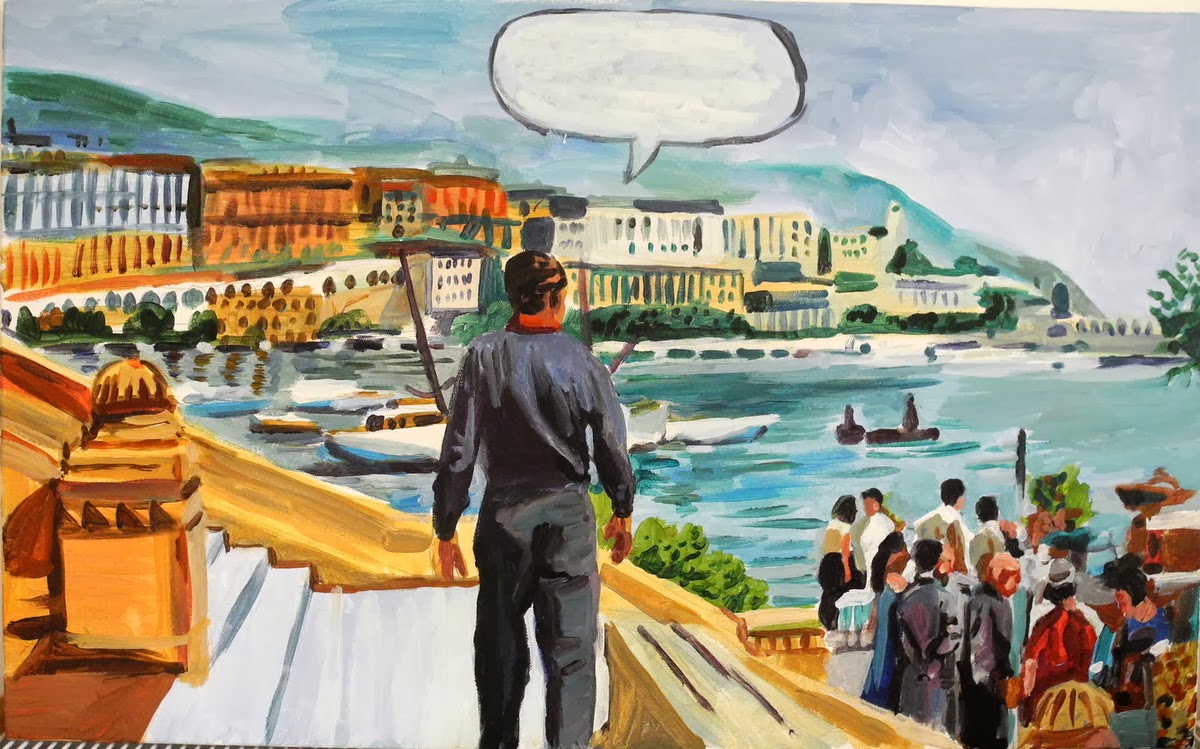
I have recently been interested in exploring a very specific thing in painting. Specific in the sense that it is a particular moment in a particular scene in a film. I have on occasion painted scenes from films and I am sure I am not alone in doing this. However I am not interested in sealing a special (film) moment in time or celebrating a memorable scene, like "play it (again) Sam" or "say hello to my little friend!" To me this would be akin to painting a kind of movie poster and I am not interested in doing that, although I may have done it unintentionally in the past. I guess that would also be considered a 'homage'.
What interests me is in playing with the narrative of the scene. In the example of the painting above, I have inserted a speech bubble above the character's head, a blank one as I was unsure as to what he would be saying. In the film this painting was derived from he actually does not speak at this point in the scene, but you probably get a sense of his agitation or controlled panic through his movement and the accompanying soundtrack as he tries to get away.
I like the idea of trying to stop or interject a different narrative at this point, in order to make the scene more contemplative, it is now after all a painting. I guess that's the point in a way, there isn't another scene coming along, that's all you're getting. You could ask the question why paint this particular scene and if you do how do you paint it so it does not feel like a lead up to another.
I think in the example above this is partly done by the speech bubble, even though empty, it re-enforces this is a moment of hesitation for the character, a time to stop, stand back and observe, maybe think about his motivation. I do think the viewer of the painting needs to have a little bit of film knowledge for this to work, enough to tell them that it reminds them of some 1950s or 60s film. I think this is important, as it will then have more resonance in terms of a change or stop in the action rather then just some bloke standing in front of some seaside town.
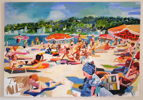
10.11.2013
A Closer look at Pool Scene by Stephen Abela
Last night the Viewer’s Choice Award for this year’s Threadneedle Prize 2013 was awarded to Conrad Engelhardt for his Cork-filled portrait of Aung San Suu Kyi – congratulations to him for winning the £10,000! However in this, our final Threadneedle post for 2013, we discuss high glamour, nostalgia and vibrant colour with our last-but-not-least favourite Threadneedle contender, Stephen Abela.
Lisa: What draws you to the subject of the pool scene?
Stephen: The pool scene painting is based on a 1960s postcard image. I like this type of subject for two reasons. First it has an almost classical setting in terms of figure and ground; near naked figures against idyllic natural backdrops as in a Titian or Veronese painting. In this scene in particular the figures are in motion and there is a lot of action, you could say it has a baroque sensibility which appeals to me.
The second reason is nostalgia. As a child growing up in Malta in the 1970s and 80s I spent a lot of time around pools and beaches so it’s a kind of nostalgia for another time even though perhaps one mostly in my imagination.
Lisa: Who are your influences?
Stephen: I admire the Bay Area painters, especially Richard Diebenkorn. There is also this lesser known second generation Bay Area artist Roland Petersen who I think is underrated. Bonnard, Malcolm Morley are another couple that stand out. I like artists who are are deft and spotaneous when handling paint, like Sargent and Bellows. I just visited the Peter Doig exhibition in Edinburgh, I like his handling of paint for different reasons, its more laboured and layered and has a really sophisticated colour palette.
Lisa: Do you use mediums to manipulate your paint? What brand/s of acrylic colour do you like to use?
Stephen: I am using Acrylic paint at the moment, it dries quickly and doesn’t smell but its not as exciting as oil to manipulate, so I mix various mediums together to build body and give it a sheen. In term of paint brands, Jackson’s, Golden, Liquitex and Winsor and Newton is what I generally use.
Lisa: How do you select your colours for a painting?
Stephen: I generally select colour based on the subject matter, which tends to mean oranges, Naples yellow and crimsons for figures. I use a lot of turquoise and cerulean blue for pools and sea. I would say I tend toward a more impressionist palette, I don’t exclude blacks or greys – but I use primaries where I can. Often when painting from an old photo I am captivated by the printing ink which bleeds and is slightly blurred and you can see the individual colours used -which gives it a sort of Impressionist – Divisionist feel and makes me want to replicate the colour effect on canvas. I am always looking for new colour combinations that appeal to me as I don’t think of myself as a natural colourist and I have had to learn to use colour by trial and error. I borrow where I can I still make mistakes, although hopefully not such bad ones anymore.
Lisa: On your blog I recently saw an interesting post about painting from photographs, could you tell us briefly what your thoughts are about painting from photographs vs painting from life?
Stephen: I like to think and talk about painting from photos vs from ‘real life’ as this subject is such a complex and sometimes contentious issue. In fact I think you could write a book about it. When I was in art school in the 1990s there seemed to me to be only two possibilities in relation to photos and it was a polarising situation. It was either -paint photographs exactly as they are; like a photo realist say Richard Estes or like Gerhard Richter and reduce painting to a mechanical reproductive process -or avoid painting from photographs entirely like Freud or Auerbach. I think we are now at a point where artists like Doig and Tuymans have made it ok to use photos and in a less ironic way and divisive way. Possibly photos have become more part of our lives, more personal, more ‘natural’ and thus a more acceptable starting point for a painting. I don’t feel its so much of a taboo anymore but (to paint from photos) can be a crutch and at times trivialise painting – if its simply a painted version of a printed image it’s a bit pointless. How you avoid doing this is where creativity and art comes in.
Lisa: Where do you find your subjects for painting?
Stephen: From life, from my head, but mostly from photos! I don’t tend to think about why I like something and want to paint it, I just like an image and feel it has painting possibilities. I always try to avoid just reproducing something because it looks good. I tend mainly to be attracted to colour combinations and compositions that seem out of the ordinary and are not clichés. It is sometimes difficult doing this when painting beach scenes can so easily seem pretty and hackneyed. I probably have some subconscious reason for always picking pools and beach scenes but I’m not quite sure what that is or if I really want to know. Hopefully it’s not just the pretty colours.
Lisa: Where can we see more of your work (online or in the flesh)?
Stephen: At present there are no shows in the pipeline, but you can see more of my work online:
stephenabela.tumblr.com
stephenabela.blogspot.com
The Threadneedle Prize for Painting and Sculpture is open daily from 10am – 5pm from the 25th September – 12th October 2013. Admission Free.
The Threadneedle Prize for Painting & Sculpture 2013, at The Mall Galleries, The Mall (near Trafalgar Square), SW1 All images are copyright of the artist.

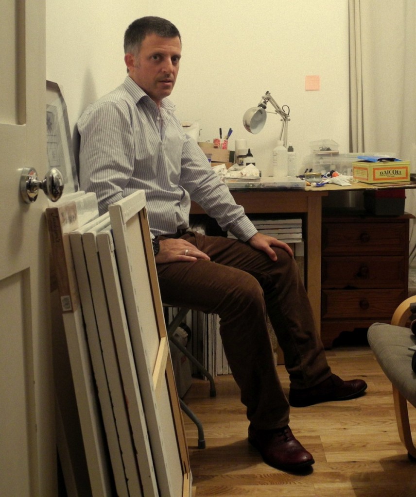
Stephen Abela in his studio
The painting is reminiscent of 1950s watercolour illustration, and depicts an archetypal holiday resort pool scene – this pool scene could pretty much be anywhere in the world, and almost any time in the world, although thanks to the manner in which it has been painted, as well as the cars and the outdoor furniture, it points to the 1950s and 1960s. There is something very idealistic about the painting – no one has a care in the world, all are relaxed and enjoying their holiday and the company of their family. The painting is filled with light and posterised, saturated colour…the reds used are very primary and saturated, and the most powerful, and although the other colours in the painting are lightened with plenty of white acrylic paint, they appear bright and vibrant as opposed to gaunt or washed out. I asked Stephen Abela about his work.Lisa: What draws you to the subject of the pool scene?
Stephen: The pool scene painting is based on a 1960s postcard image. I like this type of subject for two reasons. First it has an almost classical setting in terms of figure and ground; near naked figures against idyllic natural backdrops as in a Titian or Veronese painting. In this scene in particular the figures are in motion and there is a lot of action, you could say it has a baroque sensibility which appeals to me.
The second reason is nostalgia. As a child growing up in Malta in the 1970s and 80s I spent a lot of time around pools and beaches so it’s a kind of nostalgia for another time even though perhaps one mostly in my imagination.
Lisa: Who are your influences?
Stephen: I admire the Bay Area painters, especially Richard Diebenkorn. There is also this lesser known second generation Bay Area artist Roland Petersen who I think is underrated. Bonnard, Malcolm Morley are another couple that stand out. I like artists who are are deft and spotaneous when handling paint, like Sargent and Bellows. I just visited the Peter Doig exhibition in Edinburgh, I like his handling of paint for different reasons, its more laboured and layered and has a really sophisticated colour palette.
Lisa: Do you use mediums to manipulate your paint? What brand/s of acrylic colour do you like to use?
Stephen: I am using Acrylic paint at the moment, it dries quickly and doesn’t smell but its not as exciting as oil to manipulate, so I mix various mediums together to build body and give it a sheen. In term of paint brands, Jackson’s, Golden, Liquitex and Winsor and Newton is what I generally use.
Lisa: How do you select your colours for a painting?
Stephen: I generally select colour based on the subject matter, which tends to mean oranges, Naples yellow and crimsons for figures. I use a lot of turquoise and cerulean blue for pools and sea. I would say I tend toward a more impressionist palette, I don’t exclude blacks or greys – but I use primaries where I can. Often when painting from an old photo I am captivated by the printing ink which bleeds and is slightly blurred and you can see the individual colours used -which gives it a sort of Impressionist – Divisionist feel and makes me want to replicate the colour effect on canvas. I am always looking for new colour combinations that appeal to me as I don’t think of myself as a natural colourist and I have had to learn to use colour by trial and error. I borrow where I can I still make mistakes, although hopefully not such bad ones anymore.
Lisa: On your blog I recently saw an interesting post about painting from photographs, could you tell us briefly what your thoughts are about painting from photographs vs painting from life?
Stephen: I like to think and talk about painting from photos vs from ‘real life’ as this subject is such a complex and sometimes contentious issue. In fact I think you could write a book about it. When I was in art school in the 1990s there seemed to me to be only two possibilities in relation to photos and it was a polarising situation. It was either -paint photographs exactly as they are; like a photo realist say Richard Estes or like Gerhard Richter and reduce painting to a mechanical reproductive process -or avoid painting from photographs entirely like Freud or Auerbach. I think we are now at a point where artists like Doig and Tuymans have made it ok to use photos and in a less ironic way and divisive way. Possibly photos have become more part of our lives, more personal, more ‘natural’ and thus a more acceptable starting point for a painting. I don’t feel its so much of a taboo anymore but (to paint from photos) can be a crutch and at times trivialise painting – if its simply a painted version of a printed image it’s a bit pointless. How you avoid doing this is where creativity and art comes in.
Lisa: Where do you find your subjects for painting?
Stephen: From life, from my head, but mostly from photos! I don’t tend to think about why I like something and want to paint it, I just like an image and feel it has painting possibilities. I always try to avoid just reproducing something because it looks good. I tend mainly to be attracted to colour combinations and compositions that seem out of the ordinary and are not clichés. It is sometimes difficult doing this when painting beach scenes can so easily seem pretty and hackneyed. I probably have some subconscious reason for always picking pools and beach scenes but I’m not quite sure what that is or if I really want to know. Hopefully it’s not just the pretty colours.
Lisa: Where can we see more of your work (online or in the flesh)?
Stephen: At present there are no shows in the pipeline, but you can see more of my work online:
stephenabela.tumblr.com
stephenabela.blogspot.com
The Threadneedle Prize for Painting and Sculpture is open daily from 10am – 5pm from the 25th September – 12th October 2013. Admission Free.
The Threadneedle Prize for Painting & Sculpture 2013, at The Mall Galleries, The Mall (near Trafalgar Square), SW1 All images are copyright of the artist.
Subscribe to:
Posts (Atom)